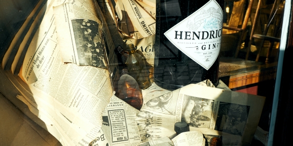
I’ve had people flat-out tell me, “You couldn’t have possibly created Hendrick’s Gin — it’s from the 1800s!”
I love that.
You know you’ve done a good job with your branding when people literally can’t tell what era it spawned from. They see the old-timey apothecary bottle from the 1830s, the penny-farthing iconography from the 1870s, the Monty Python cartooning from the 1960s, all wrapped around a gin created in the late 1990s and now advertised in 2022. It f***s with the mind!
And that’s great for branding.
That’s exactly what we did with Sailor Jerry. It looks like it’s straight off the shelf of your grandpop’s basement bar. We purposely do not look at any design trends. We want our brands to evoke an ambiguous period that they’re inspired by, during which they’re supposed to have been created.
In fact, being right on trend is a sign of failure for me. Great packaging should transcend the ages, not be of the moment. I want my brands not only to last 100 years but to look as if they have already been around for 100 years. This avoids the fate of Ed Hardy’s clothing line, which seemed too of the moment and quickly fell into the dustbin of fashion.
Simply reviving an old label or an old logo isn’t a guarantee of longevity or success. You realize pretty quickly that old stuff, when unaltered, can look a little too frumpy. But when you mash up something old with something else, maybe even something new, it immediately has a cool vibe. It’s almost a trick of the mind.
“Where did that come from?” people will wonder.
Suddenly there’s not just a historical mystique but something that feels modern and as if it has an inherent truth to it. You need to have some degree of truth in order for your brand to resonate with people. Everything branches out from that inherent truth. So that’s the key trick we’ve employed over the years when it comes to our design work: We make it ugly on purpose — to most people in advertising …
But it’s beautiful to me.
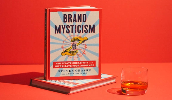
Brand Mysticism is available now.


