MENU
Starting a Business
- Best Small Business Loans
- Best Business Internet Service
- Best Online Payroll Service
- Best Business Phone Systems
Our Top Picks
- OnPay Payroll Review
- ADP Payroll Review
- Ooma Office Review
- RingCentral Review
Our In-Depth Reviews
Finance
- Best Accounting Software
- Best Merchant Services Providers
- Best Credit Card Processors
- Best Mobile Credit Card Processors
Our Top Picks
- Clover Review
- Merchant One Review
- QuickBooks Online Review
- Xero Accounting Review
Our In-Depth Reviews
- Accounting
- Finances
- Financial Solutions
- Funding
Explore More
Human Resources
- Best Human Resources Outsourcing Services
- Best Time and Attendance Software
- Best PEO Services
- Best Business Employee Retirement Plans
Our Top Picks
- Bambee Review
- Rippling HR Software Review
- TriNet Review
- Gusto Payroll Review
Our In-Depth Reviews
- Employees
- HR Solutions
- Hiring
- Managing
Explore More
Marketing and Sales
- Best Text Message Marketing Services
- Best CRM Software
- Best Email Marketing Services
- Best Website Builders
Our Top Picks
- Textedly Review
- Salesforce Review
- EZ Texting Review
- Textline Review
Our In-Depth Reviews
Technology
- Best GPS Fleet Management Software
- Best POS Systems
- Best Employee Monitoring Software
- Best Document Management Software
Our Top Picks
- Verizon Connect Fleet GPS Review
- Zoom Review
- Samsara Review
- Zoho CRM Review
Our In-Depth Reviews
Business Basics
- 4 Simple Steps to Valuing Your Small Business
- How to Write a Business Growth Plan
- 12 Business Skills You Need to Master
- How to Start a One-Person Business
Our Top Picks
Learn by Example: 7 Great Mobile-Friendly E-Commerce Websites

Table of Contents
Despite the ubiquitousness of smartphones, mobile devices have struggled as a shopping platform. Small screens and navigation issues often make it challenging for online shoppers to browse, select items and check out seamlessly, as they can on desktop e-commerce sites.
Consumers expect a frictionless e-commerce experience on desktop and mobile platforms – and some e-tailers are getting it right. We’ll showcase seven mobile-friendly e-commerce websites to show online businesses how to create a great mobile user experience.
According to the recent Digital Experience Benchmark report, the average successful lead conversion rate for desktop e-commerce sites is 3.7 percent, while the mobile site conversion rate is 2.2 percent.
What is a mobile-friendly website?
Mobile-friendly websites use responsive web design to adapt web pages to smartphone and tablet screens, making them easy to navigate. You don’t have to create one design for Apple phones and another for Samsung phones because responsive designs adapt to individual screen sizes and aspect ratios on all mobile devices.
Responsive web design prioritizes building aesthetically pleasing web pages with user-friendly navigation that functions well on all devices.
Mobile-friendly websites incorporate the following concepts:
- Mobile-friendly websites adapt to small screens. Screen real estate is vastly constrained on a cell phone compared to desktop or laptop computers. Mobile-friendly websites overcome this limitation with slide-in menus and well-positioned search bars.
- Mobile-friendly websites minimize user interactions. While navigating on a smartphone will never be as easy as on a desktop, online businesses must find ways to minimize the number of interactions (like swipes or touches) smartphone visitors must perform to navigate their mobile websites.
- Mobile-friendly websites use input elements carefully. How visitors input information is of particular importance, especially on e-commerce sites. For example, when filling in an online form, the pop-up keyboard may take up to half a phone’s screen real estate. How well the input elements on a site share the screen with the keyboard can determine how many inquiries and sales you get.
“Responsive design” was first coined in 2010 by coder and designer Ethan Marcotte. Without a responsive web design process, we’d still be pinching and zooming on smartphone web pages.
7 great mobile-friendly e-commerce websites
Here are seven examples of e-commerce websites that have optimized the mobile experience. We tested each on several smartphones and tablets to ensure they provide seamless mobile performance. If you have an e-commerce store or are about to start selling online, these are excellent models to emulate.
1. Etsy
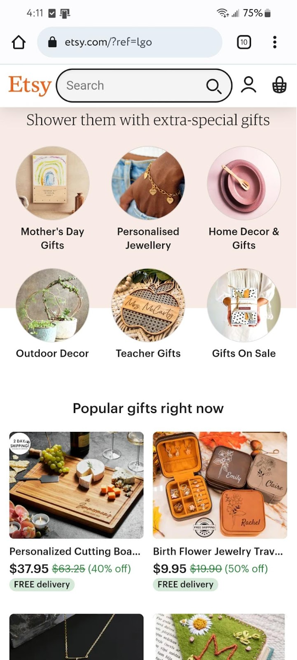
Etsy mobile homepage. Image Source: Etsy
Etsy is a popular e-commerce site comprised of third-party sellers who use the platform to sell their unique creations directly to the public. Etsy is perhaps best known as a mobile app, but both its mobile website and mobile app are very user-friendly and well executed.
The homepage features thumbnails that take you directly to the site’s most popular categories. Listing all product categories would be challenging on a phone because of the restricted screen size. However, Etsy gets around this limitation well with its smart navigation menu. And as soon as you select the search bar at the top and start typing, you’re immediately presented with product categories. For example, type in “H,” and you get a complete list, from “home décor” to “hoodie.”
Takeaway: Keep it simple. Shoppers prefer a straightforward design that makes it easy to quickly find what they want.
2. Express
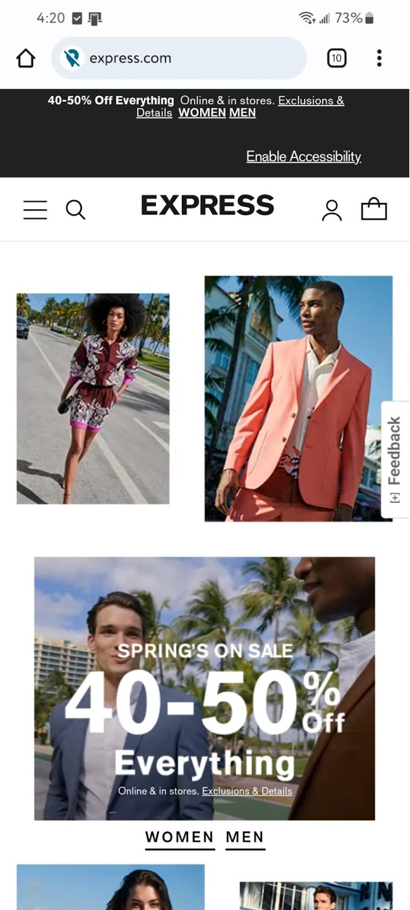
Express.com mobile homepage. Image source: Express.com
This clothing store caters to young men and women – an audience whose time Express clearly respects by making its mobile site very intuitive. The prominent hamburger menu gives you one- or two-click access to various departments. Additionally, the well-positioned search bar gives users instant links to trending search terms.
Imagery is very clear on the site, and the “Style It With” function is helpful, pointing visitors to other clothes and accessories that would complement the particular item they’re viewing. Another nice touch is how users can swipe left on a product image to see a different view of each piece, even if the thumbnails are off-screen.
Takeaway: Shoppers want instant gratification. Everything on the Express website can be done in one or two clicks. The recommendation engine is a natural way to promote upsells and cross-sells. Letting shoppers see multiple item views without extra clicks dramatically enhances the user experience.
3. Nike
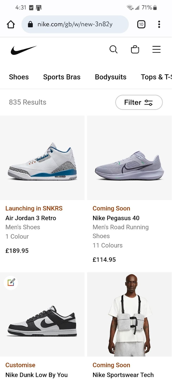
Nike’s new and featured page on mobile. Image source: Nike.com
This well-known shoemaker and retailer relies on stunning product photos and concise copy to lure users. The site’s minimalist design focuses on the products with detailed, clear and fast-loading images.
There are three main icons at the top of the page: a search bar, a shopping cart and a drop-down menu to access categories. Once in the menu, you’re two clicks away from getting to the department you want.
Takeaway: Busy shoppers appreciate it when the products they’re interested in are accompanied by high-quality images and clear, descriptive copy. Without these elements, you risk losing visitors’ attention. Your website competes against text messages, Facebook updates, and the lure of Snapchat, Pinterest, TikTok, Periscope and LinkedIn. You don’t have much time to grab and keep a shopper’s attention.
Website design mistakes that hurt conversion rates include missing or unclear call-to-action buttons, bad stock images, and confusing site navigation.
4. Threadless

Threadless homepage . Image source: Threadless.com
Like many massive online platforms, how well you organize your products is key to making them easy for visitors to find. When you arrive on the Threadless homepage, you’re presented with a helpful curated set of collections. If you want to dig deeper, you can find creators via the search bar and use the hamburger menu to access individual departments and their subcategories.
The product pages are attractive and functional. Most products have a selection of images, allowing deeper inspection by the visitor. You can also browse customer feedback about products you’re considering purchasing.
Takeaway: Threadless is, in many ways, a textbook example of how e-commerce providers should use the limited space available on a smartphone screen. Getting around the site is fast, fluid and intuitive. Each page is attractive and well laid out, and the site makes it easy to do what you want.
5. Lush
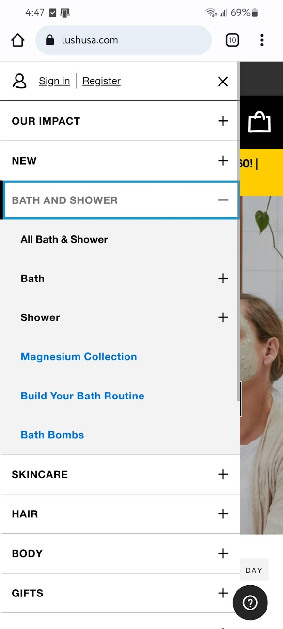
Navigation on the Lush smartphone website . Image source: Lush.com
This handmade soaps and cosmetics brand presents its products in a clean and appealing grid format with large product images. There’s a prominent “add to cart” button under each item, eliminating the need to open a new page for that specific item. A single click adds your desired item to your shopping cart, allowing you to continue browsing where you left off.
This attractive, minimalist site sells the brand well, and the user experience is a clear priority. The two-click slide-in menu that appears when you press the hamburger item is pleasing, and the predictive search bar is especially helpful on smaller devices without real keyboards.
Takeaway: Predictive search is a feature more e-tailers should integrate into their websites. It helps speed up a user’s search process, providing an even better user experience. From an e-tailer’s perspective, searches offer another opportunity to promote products by including them prominently in the search results, as Lush does.
6. MyDeal Australia
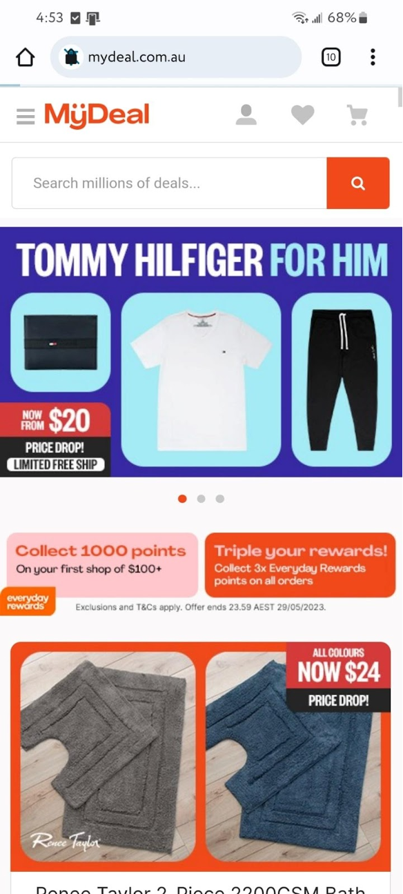
MyDeal smartphone homepage. Image source: MyDeal Australia
This global online retailer, based in Australia, sells everything from electronics to housewares – a kind of Antipodean Amazon. Navigation is executed just as well on MyDeal as it is on Amazon. One touch takes you to MyDeal’s departments (for example, Electronics), two touches takes you to product groupings (TVs & Projectors), and three touches brings you to product types (DVD players).
The website’s product images are high quality, and the fonts are large enough for easy viewing across all devices. The checkout process is simple and easy on all devices, and the shipping charges are immediately visible throughout the entire checkout process, not just on the final page.
Takeaway: MyDeal’s desktop, mobile and app iterations look great and function well. Real care has been taken to provide the highest levels of functionality and ease of use across all three platforms. The app’s larger font size is helpful for those who may be visually impaired and those who may need reading glasses.
7. Amazon
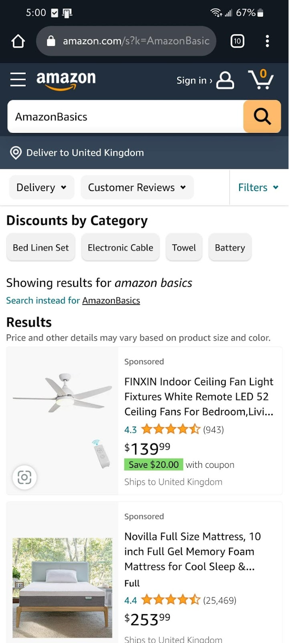
Amazon smartphone homepage. Image source: Amazon.com
Amazon’s website looks identical to the app, so it’s very familiar as soon as the page loads. It offers the same ability to search via department or automated suggestions when typing into the search bar. The site is quick, and it’s easy to get where you want.
Since Amazon’s early days, it has obsessively focused on delivering what customers want and not winning design awards. It shows on its mobile site.
Takeaway: If you have many products, make your website easy to navigate by allowing shoppers to search by department and category, as Amazon has done. Ensure the department links are prominent at the top of the page and are easy to find. Be consistent with your linking structure throughout the website so you don’t confuse shoppers.
The best e-commerce platforms and shopping cart software include mobile optimization, online store integrations and social commerce tools.
Why does mobile-friendliness matter?
Your desktop monitor and laptop screen are likely widescreen, HD (or even 4K) devices. You have a keyboard and mouse for easy website navigation. You’re probably sitting at a desk with an excellent internet connection. Stepping away from the desk is easy if you must grab your credit or debit card to pay for items you want to purchase.
When shopping on your smartphone, you don’t have these luxuries. Cell coverage may be patchy. You’re looking at a six- or seven-inch screen, and you must pinch and zoom to get a proper look at the items you’re considering. Entering your address details and payment information on the screen can be challenging because the keyboard often pops up unexpectedly, stopping further input.
Despite many great strides in mobile UX (user experience) in the last decade, shopping on a smartphone is still a challenge for many. To win more orders, you must make your site’s mobile version as seamless and intuitive as possible because smartphone shopping will always be harder.
A UX designer can create mobile apps, mobile sites and desktop websites that optimize the user experience and continually improve your customer-facing options.
Creating a great mobile experience for your customers
To create a great mobile experience for your customers, you must consider their difficulties and build solutions into your design.
Steps you can take to build an online business with a great mobile user experience include the following:
- Minimize user actions on your mobile site. Make it as simple and intuitive as possible for visitors to find their way to the desired product or service. If you can find a way to reduce three clicks to two, take it. For sites with extensive inventories, departmentalize your menu and offer a search bar that gives suggestions based on what visitors type.
- Take advantage of mobile gestures on your mobile site. Use the touch and swipe gestures built into smartphones in your design. For example, Express lets visitors left- and right-swipe to scroll through carousels of product images instead of just touching related thumbnails.
- Reduce website and asset loads on your mobile site. Smartphones are very powerful. However, just like desktops and laptops, you’ll slow them down if you don’t optimize your images and minimize the use of coding (like JavaScript). Whenever possible, reduce the amount of work phones accessing your website must perform.
- Don’t use pop-ups on your mobile site. Pop-ups significantly disrupt website flow. If you want to offer a discount code, put it on each page instead of disrupting your visitors with pop-ups.
- Remember who’s visiting your mobile site. Amazon understood this early when it introduced one-click purchasing. It uses cookies to remember visitor information and keeps payment cards on file. This sort of functionality is built into platforms like Shopify, so use them when creating your mobile website.
Genia Stevens contributed to this article.


