MENU
Starting a Business
- Best Small Business Loans
- Best Business Internet Service
- Best Online Payroll Service
- Best Business Phone Systems
Our Top Picks
- OnPay Payroll Review
- ADP Payroll Review
- Ooma Office Review
- RingCentral Review
Our In-Depth Reviews
Finance
- Best Accounting Software
- Best Merchant Services Providers
- Best Credit Card Processors
- Best Mobile Credit Card Processors
Our Top Picks
- Clover Review
- Merchant One Review
- QuickBooks Online Review
- Xero Accounting Review
Our In-Depth Reviews
- Accounting
- Finances
- Financial Solutions
- Funding
Explore More
Human Resources
- Best Human Resources Outsourcing Services
- Best Time and Attendance Software
- Best PEO Services
- Best Business Employee Retirement Plans
Our Top Picks
- Bambee Review
- Rippling HR Software Review
- TriNet Review
- Gusto Payroll Review
Our In-Depth Reviews
- Employees
- HR Solutions
- Hiring
- Managing
Explore More
Marketing and Sales
- Best Text Message Marketing Services
- Best CRM Software
- Best Email Marketing Services
- Best Website Builders
Our Top Picks
- Textedly Review
- Salesforce Review
- EZ Texting Review
- Textline Review
Our In-Depth Reviews
Technology
- Best GPS Fleet Management Software
- Best POS Systems
- Best Employee Monitoring Software
- Best Document Management Software
Our Top Picks
- Verizon Connect Fleet GPS Review
- Zoom Review
- Samsara Review
- Zoho CRM Review
Our In-Depth Reviews
Business Basics
- 4 Simple Steps to Valuing Your Small Business
- How to Write a Business Growth Plan
- 12 Business Skills You Need to Master
- How to Start a One-Person Business
Our Top Picks
Fact or Fiction: 5 Common Downfalls of Data Visualizations
Table of Contents
Now more than ever, visuals are used to relay facts and figures in business, politics and socioeconomics. Data visualizations – such as graphs, charts and tables – are commonplace in presentations. When used correctly, they can be used to establish trust, tell a story and illustrate complex ideas.
However, visuals can also be manipulated to support the narrative the author wants to portray. Misleading and confusing images can skew the data and lead to misinformation guiding important decisions. Deceptive data visualizations lead to residual effects like miscommunication and a loss of trust.
Let’s look at some common data visualization mistakes to avoid, and how you can use effective data visualization in your business.
Sharing misinformation can seriously hurt your brand’s reputation and cause you to lose your customers’ trust. Check out this article to learn tips for protecting your company’s reputation.
Common data visualization downfalls
To understand just how easily visualizations can deceive, take a look at the following examples and how they can be corrected.
1. Truncated graphs
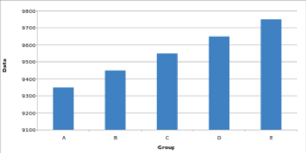
One of the most common manipulations used to control the narrative is to omit baselines or begin the y-axis of a graph at an arbitrary number instead of zero. This creates the impression that there is a significant difference between data points when the disparity is actually small.
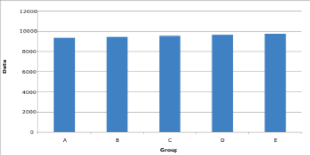
To illustrate how a truncated graph can misrepresent the information at a cursory glance, consider the two graphs below. Both contain identical data, but the truncated graph appears to show a massive difference from A to E.
Source: Sanket Shah
Source: Sanket Shah
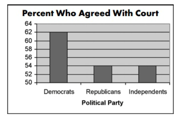
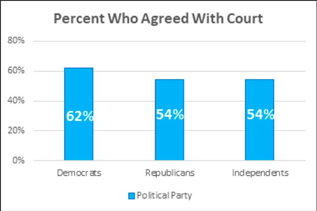
For a real-life perspective, CNN used a similar graph to show political party support for the controversial court decision surrounding the Terry Schiavo right-to-die case in 2005. Here, it appears as though almost three times as many Democrats supported the decision as Republicans and independents, when in reality, there’s only about a 14 percent difference.
Source: Western Reserve Public Media
Setting the baseline to zero would have better represented the data.
Source: Sanket Shah
Additionally, clearly placed labels help further tell the complete story and decrease the amount of time it takes to process the information.
2. Exaggerated scaling
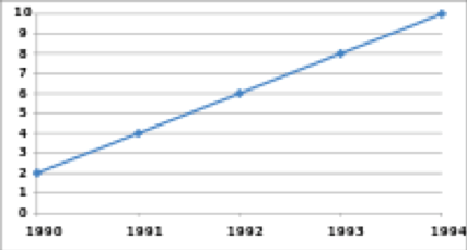
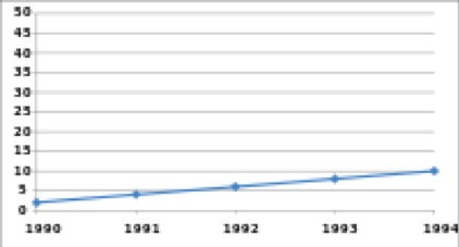
Line charts, often used to show rates of change over time, are notoriously simple to skew in favor of a chosen narrative. Unlike the bar graphs above, it’s not necessary to begin the baseline at zero to accurately portray the facts.
However, exaggerating the scale of a line graph can easily minimize or maximize the change shown. A higher y-axis value will cause a graph to reflect less volatility or growth. Conversely, a lower y-axis maximum will result in a steep line seemingly indicating increased volatility or growth.
Source: Sanket Shah
Source: Sanket Shah
If you take into account that by nature, a line graph is far more subtle than a bar graph, narrowing in on the y-axis value may help provide a more precise visualization. That way, the message can be readily and more accurately understood in seconds.
Consider this representation of global warming over time. In the first image, the y-axis has been blown out, causing the graph to indicate almost no change over time.
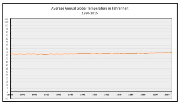
Source: National Review @NRO Twitter
However, if you zoom in, minimizing the scale of the y-axis, you’ll see a different, more factual representation.
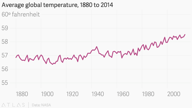
Source: Sanket Shah
3. Improper extraction
Extracting only a portion of data to align with a particular narrative, rather than letting the full story speak for itself can drastically alter perception. It’s like telling a white lie with the data.
This data visualization of General Electric Company’s performance on the stock market makes it appear as if they’re on an upward swing.
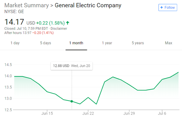
Source: NYSE
But if you were to pull back and look at the complete picture, that would tell a different story.
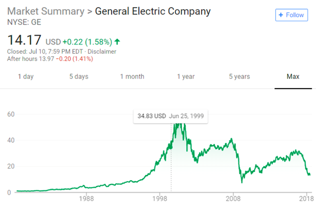
Source: NYSE
Without providing all the information it’s impossible to make an informed decision. But only providing a snippet of information results in misinformation leading to poor decision-making.
4. Going against the norm
It’s common knowledge that when talking about finances, green indicates profits and red denotes losses. Deviating from these long-held conventions can create confusion and possible misinterpretation of the facts when taken at a glance.
Here, the original visualization uses standard colors to illustrate profits and losses by state. With a quick look, you can plainly see there are more wins than losses.
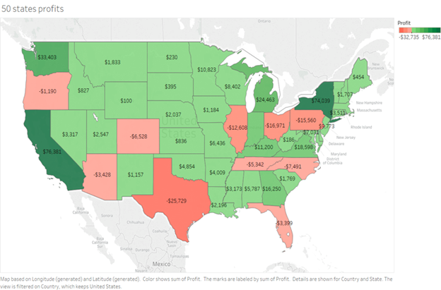
Source: Sanket Shah
However, simply by switching green for red, it would appear that losses far exceeded profits across the majority of the country.
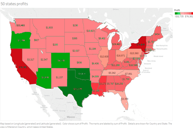
Source: Sanket Shah
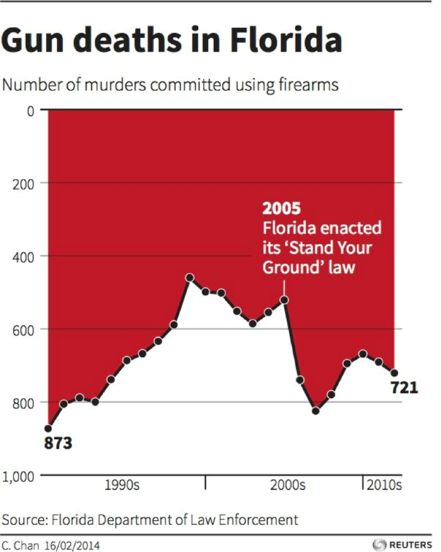
Likewise, we’re accustomed to viewing numbers that increase vertically in a chart, making the following example intentionally misleading.
Source: FL Dept. of Law Enforcement
Since the purpose of including data visualizations is to quickly convey information, altering norms such as colors or order drastically alters perception as well. To avoid confusion, stick with convention.
5. Too much pie
With pie charts, the sum of each slice must add up to the whole. When the numbers don’t add up, you know there’s an issue – whether it be sloppy mathematics or an intentional misrepresentation. A pie chart should always add up to 100%, so check your math every time.
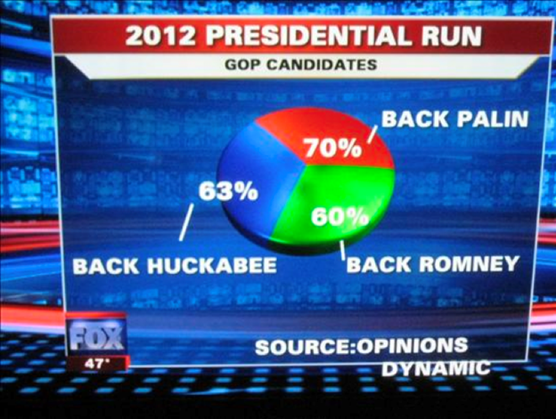
Source: Fox News
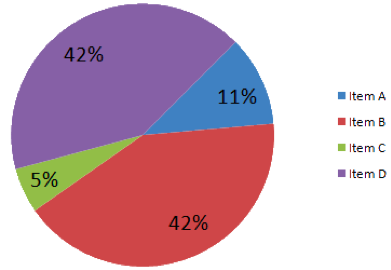
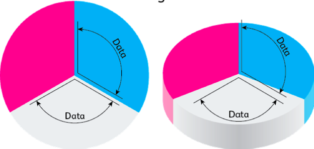
Furthermore, while 3D pie charts may look appealing, they do little to help convey accurate information and, more often than not, can cause a misinterpretation of the data.
As Edward Tufte notes in Chartjunk, designers often get caught up in the design element of 3D charts, prioritizing design and technology over the readability of the chart. Returning to the simplicity of a 2D pie chart may be in the best interest of both the reader and the data.

Source: Sanket Shah
Source: Sanket Shah
The following example further illustrates the distortion of angles that often occur in 3D pie charts.
Source: Visually
Tips for better data visualization
Data visualizations may look easy to create, but a lot of effort goes into creating an effective one. Finding the right balance of elements and avoiding common mistakes are key. Here are four tips you can use to create better data visualizations:
- Choose the graph that fits your data: When you’re coming up with a data visualization, there are many different types of graphs you can select. You need to find the one that fits your data and the message you’re trying to share with your audience. For instance, bar graphs are a good option if you’re trying to compare two or three different values within the same category.
- Keep it simple: Don’t try to share too much information in your data visualizations. That will distract the viewer from the real message you’re trying to convey. Avoid adding illegible text, additional grid lines or other unnecessary visual elements.
- Label everything clearly: Proper labeling will help you convey the message you’re sharing. For instance, you should title your graph and label each of your axes. Make sure the labels are easy to read.
- Pay attention to color: Use colors effectively in your data visualizations. Employ the same colors to convey similar types of data or use different shades to convey waning intensities. At the same time, avoid using too many colors in your visualizations, since this can easily become overwhelming.
How businesses can use data visualization
As businesses continue to collect more and more data, it can be hard to tell what is important and what isn’t. Data visualizations are a great way to cut through the noise and highlight the trends and patterns you want to focus on.
As a business owner, you can use data visualizations to uncover relationships that aren’t otherwise easily discernible. For instance, you can use data visualizations to create sales forecasts, explain customer trends, or outline bottlenecks within your operations.
Data will be used to guide many of your business decisions, but there are times when you should go with your gut.
Thanks to technology, there is a wealth of data at our disposal. But if we falsely represent that data, we do a disservice to those that would benefit from its information.
Beware of making misleading visualizations and take care not to complicate the message with overly complex or inaccurate images. Although the numbers do not lie, the visualizations representing them may.
Additional reporting by Jamie Johnson.


